Palette Lookbook
25 Sage Green Wedding Palettes That Aren't Cliché
Sage is everywhere. Here's how to use it without your reception looking like a Pinterest board run through a beige filter.
Sage green is in roughly one of every three wedding boards we audited in early 2026. That's how it stops being a palette and starts being wallpaper. Here's how to use it without your reception looking like a Pinterest grid run through a beige filter.
Why sage green keeps showing up (and what it stopped meaning)
Sage hit critical mass somewhere around 2021 as the calmer counter-trend to maximalist florals. Five years later, it's the new ivory. We see it requested in roughly a third of color-palette inquiries on Pinterest's most-saved boards, which means most couples save it because it's safe, not because it's specific. The risk: a reception where the bridesmaid dresses, eucalyptus, table runner, menu card, and welcome sign are all the exact same dusty green. Beige soup. The eye has nowhere to land.
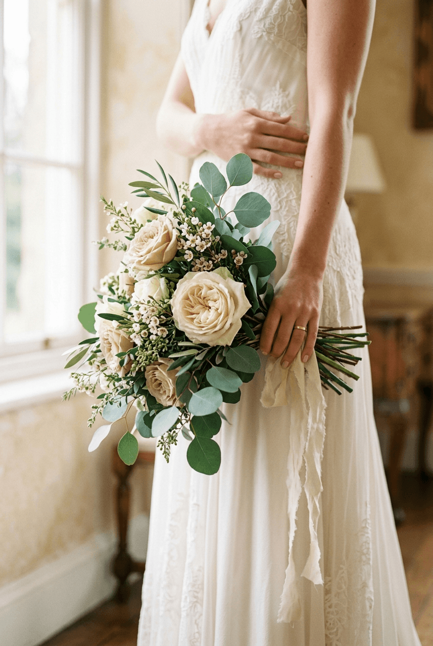
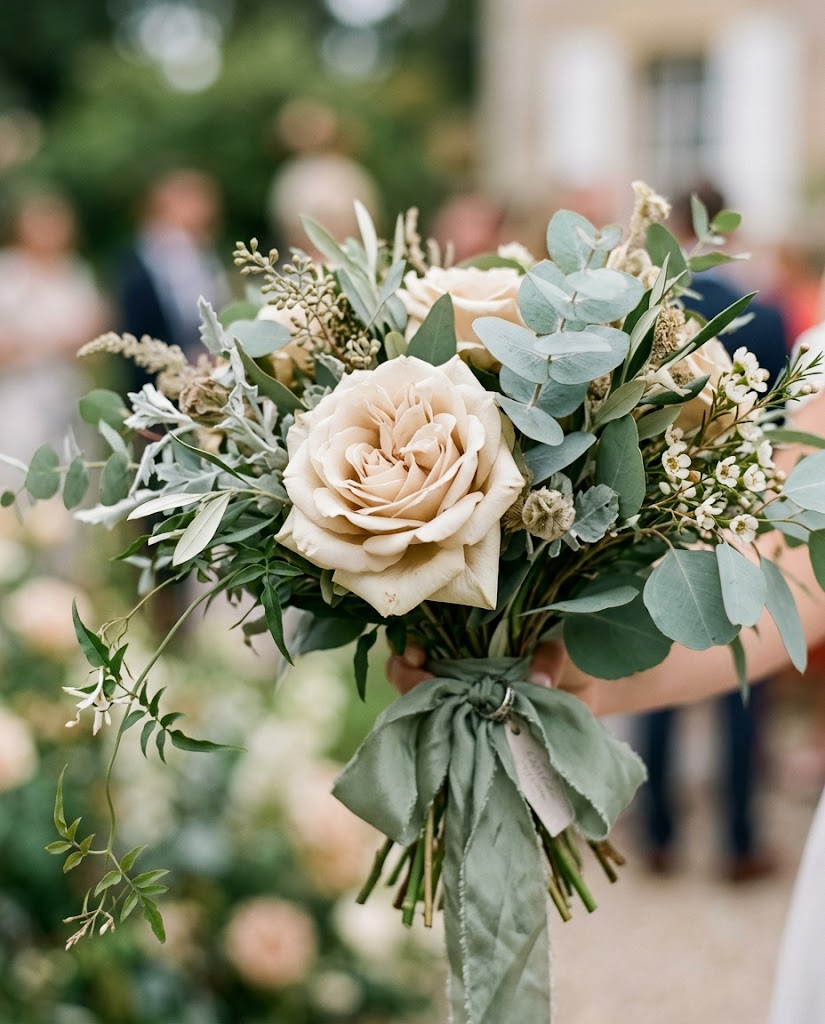
When sage works, it's because the couple chose one element to hold the color and let everything else play counterpoint. Sage bridesmaid dresses with cream florals. Eucalyptus at the table with a deep navy menu card. The palette stops being a green-on-green-on-green meditation and starts having structure.
What a sage palette actually looks like at scale
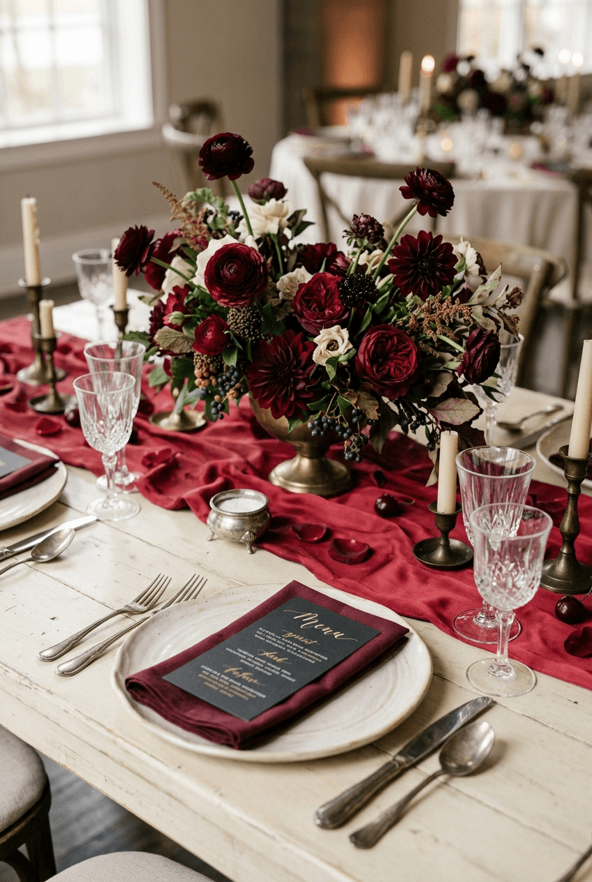
The strongest sage weddings we feature share a structural rule: sage is one of three palette colors, never the only one. It pairs cleanly with cream, deep navy, brushed brass, dusty pink, terracotta, and rust. Cream is the safest counterpoint and reads timeless. Navy adds drama. Rust drops sage from spring-bridal into autumn-warm.
Skip the temptation to match the dress flowers, the table runner, and the napkins to one another. The aim is variation within the same family, not uniformity. A florist worth their fee will push back on requests like "all sage" because they know how it photographs (flat) versus how it imagines (lush).
- Sage + cream + brushed brass: most photogenic, reads classic
- Sage + deep navy + ivory: adds drama, works for fall and winter
- Sage + rust + dried wheat: autumn-warm, perfect for September weddings
- Sage + dusty pink + cream: softer, garden-romantic, spring-summer
- Sage + black + ivory: modern, minimal, most likely to age well
"When sage works, it's because the couple chose one element to hold the color and let everything else play counterpoint."
Florals and greens that lift a sage palette
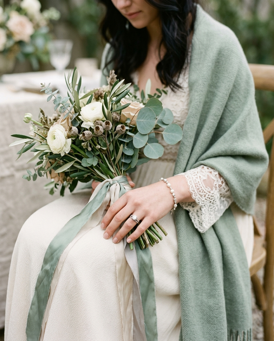
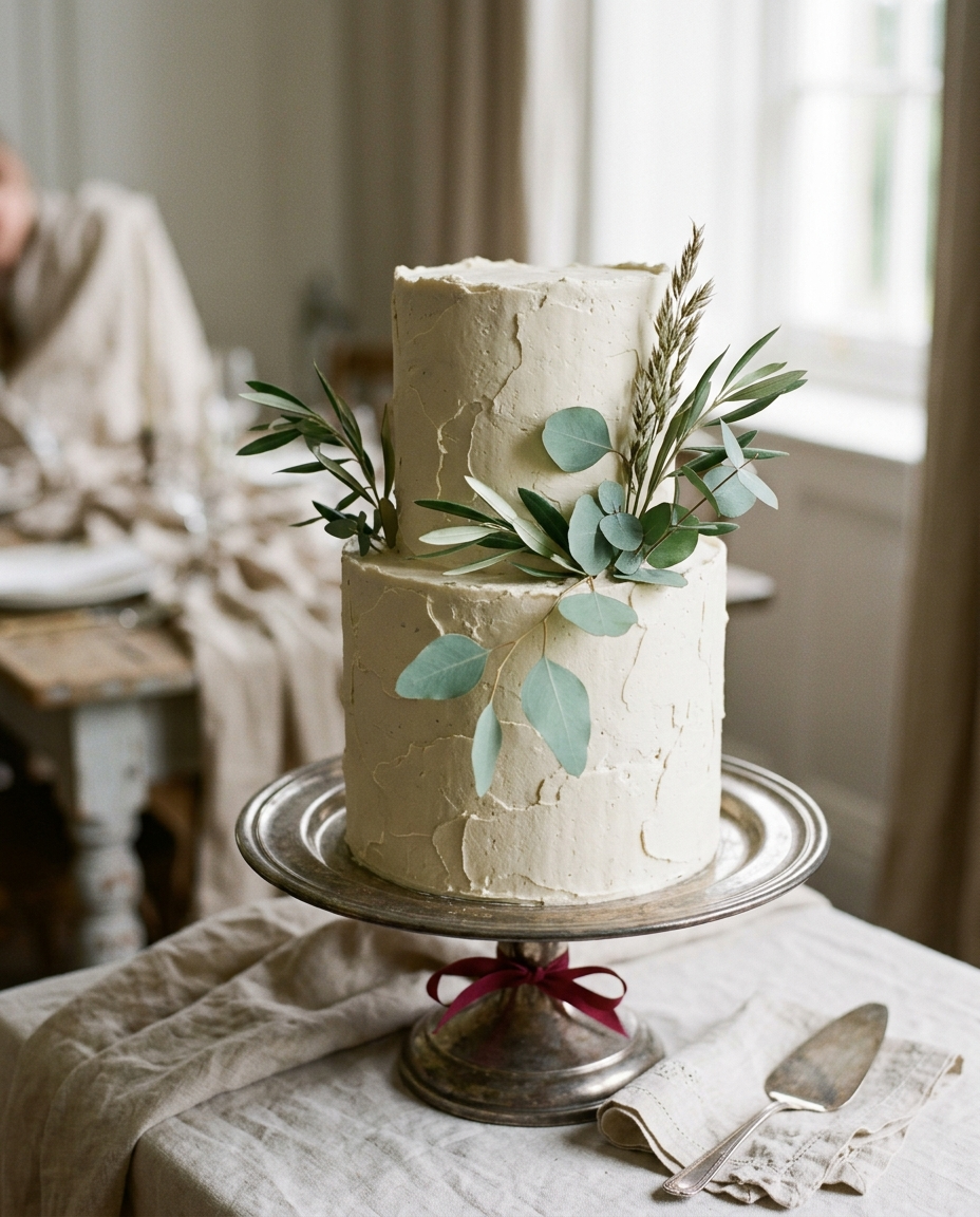
Eucalyptus is the obvious answer and partly the problem. It's everywhere, it's cheap by the bunch, and a bouquet of just eucalyptus reads more "trader joe's" than "bridal." The fix is to pair eucalyptus with structure: ranunculus and garden roses for softness, dahlias for weight, dried wheat or pampas for texture.
Florists in 2026 lean on dusty miller (the silver-fuzzy one), olive branch, and Italian ruscus to stretch the green palette without going full eucalyptus. Ask for at least three green textures in your centerpiece, not three sprigs of the same plant. The difference shows up in the photos within five minutes of golden hour.
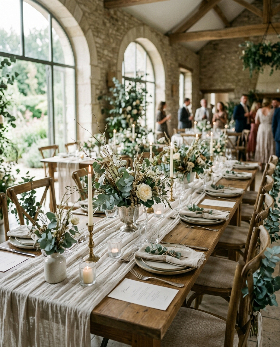
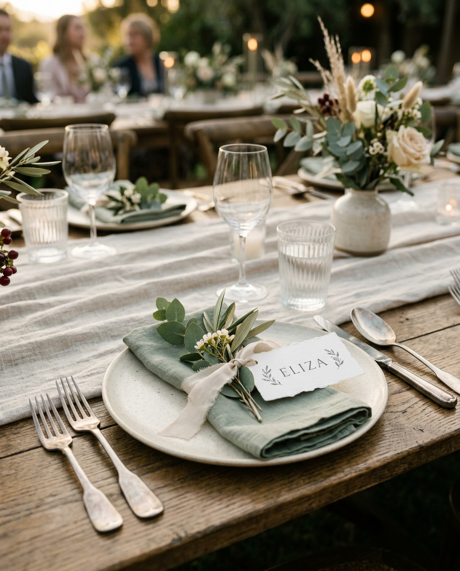
What to put on the table
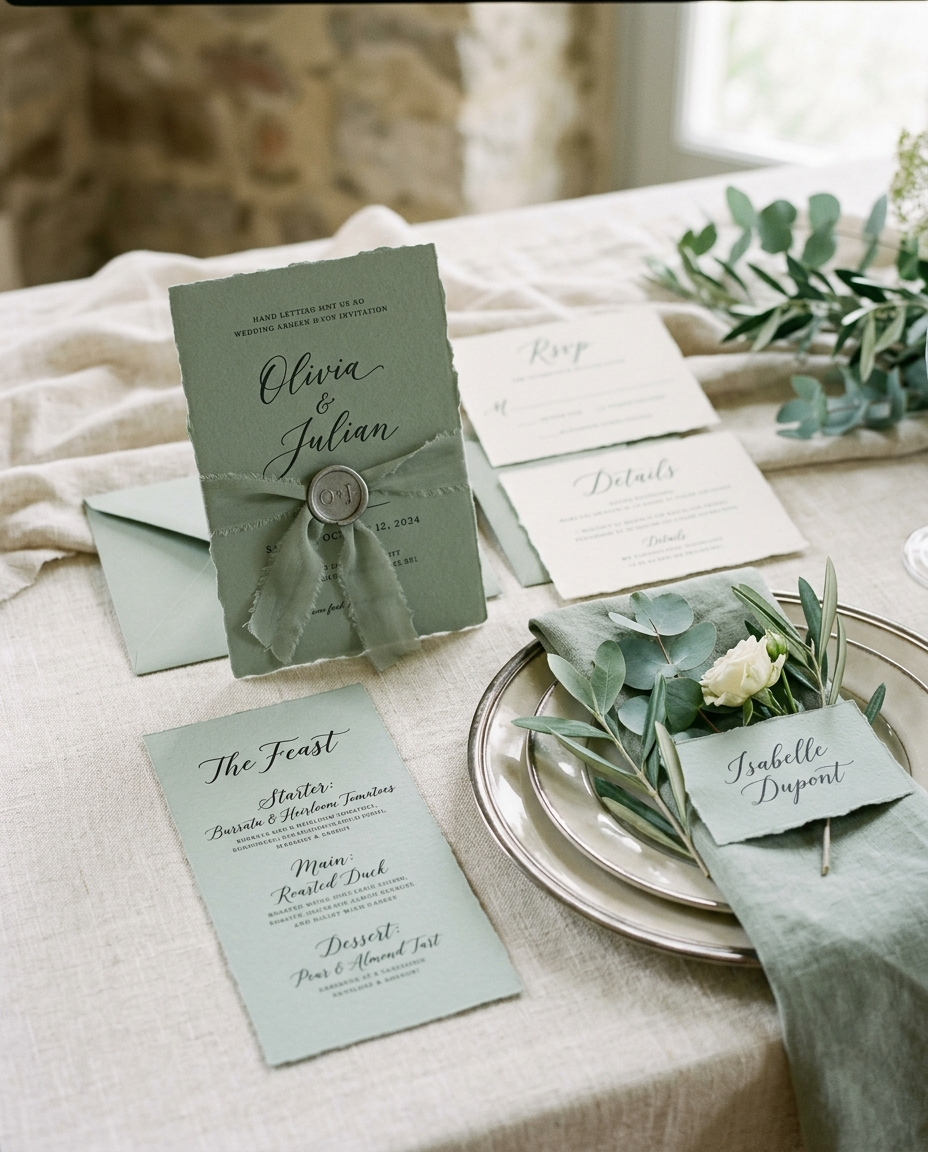
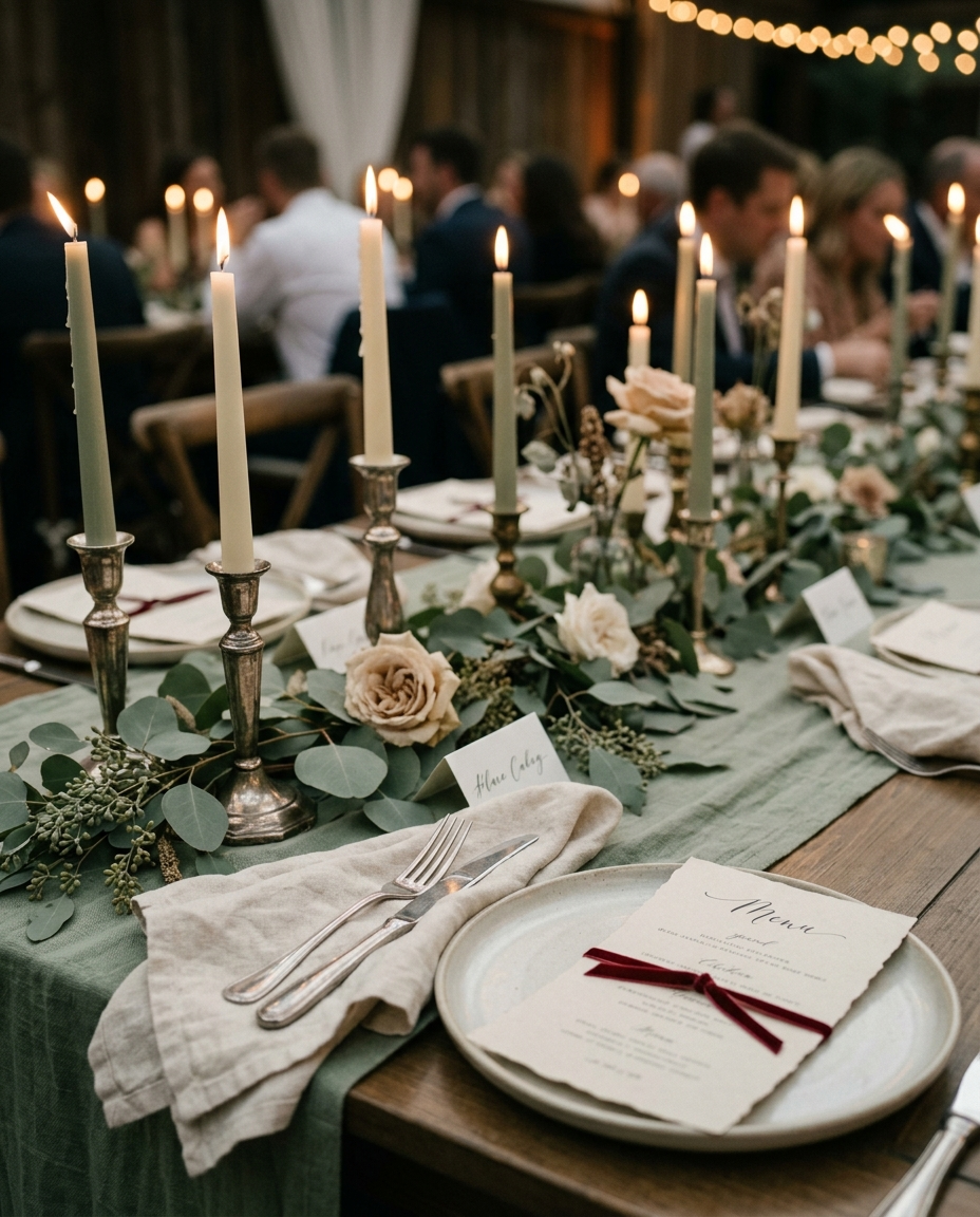
We're seeing a quiet move away from full sage table runners. They photograph as a green stripe across an otherwise neutral table and they fight with the centerpieces for attention. The strongest sage tablescapes use cream linen as the base, then layer in: a single eucalyptus or olive runner of greenery (not fabric) down the spine of the table, brushed brass or antique silver flatware, and cream or amber glassware. Place cards in cream cardstock with a single sage olive sprig tucked into the napkin fold.
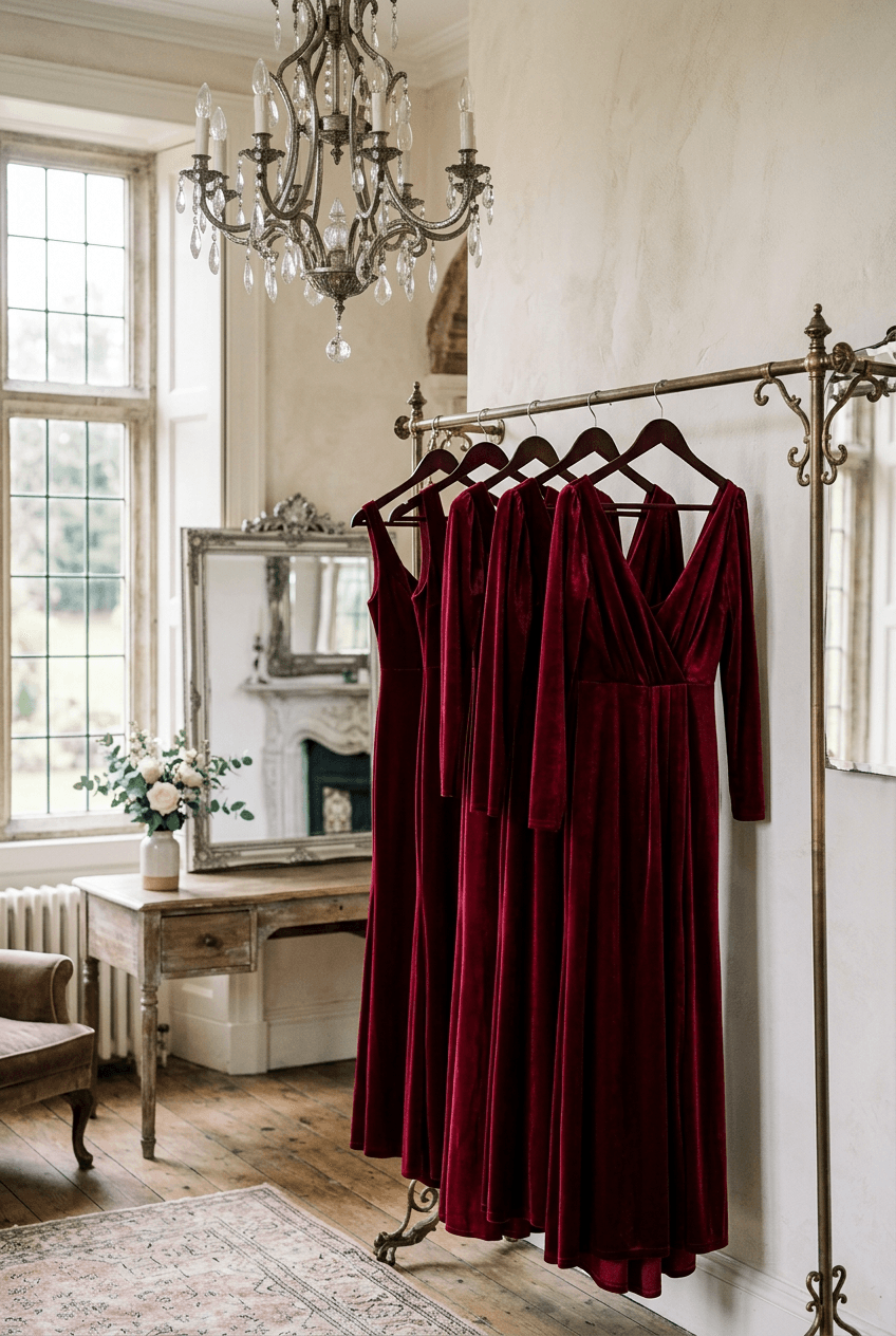
If you must do a fabric runner, pick sage velvet for winter (matte, dimensional, photographs warm) over sage linen (which can read pale and washed-out under bistro lights).
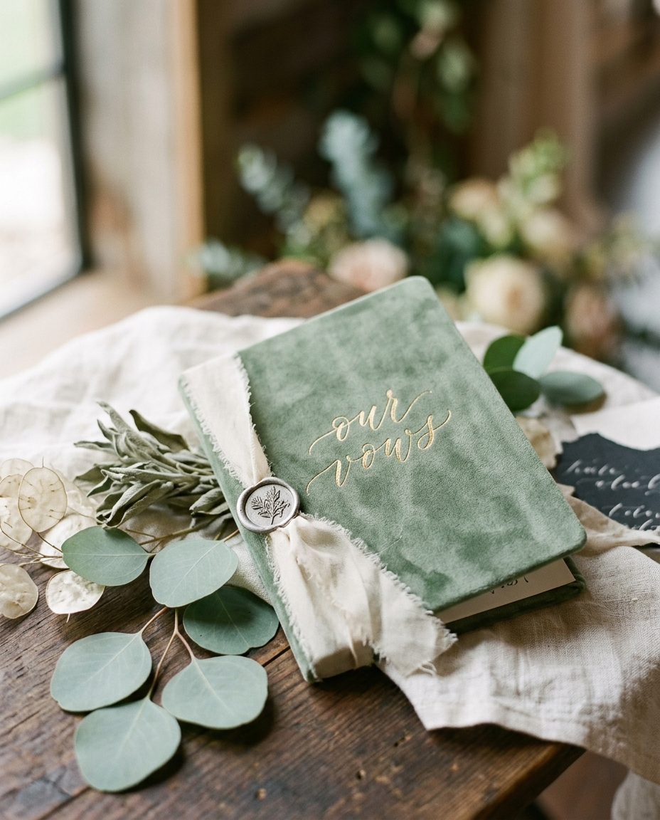
Stationery, signage, and paper
Sage on stationery is where most couples over-commit. A sage save-the-date, sage invitation, sage welcome sign, sage seating chart, sage menu, and sage place card means by the time guests sit down, sage has lost its weight. Use sage as an accent in stationery, not the substrate. Cream or ivory paper, deep ink lettering (charcoal or burgundy), small sage botanical illustrations as the only color moment.
If you want a true sage paper moment, save it for the largest piece (the welcome sign or seating chart) and leave invitations cream. The contrast between sage at the entrance and ivory at the table reads intentional rather than thematic.
What the light does to sage (and how to plan around it)
Sage shifts dramatically across the day. Under midday sun, it photographs grayish and cool. Under bistro string lights or candlelight, it warms toward olive and reads richer. This is why sage daytime ceremonies often photograph paler than the couple expected, and sage evening receptions feel saturated and intentional.
If your ceremony is daytime and reception is evening, accept that sage will look like two different colors in the album. Lean into it: cream-heavy ceremony florals, sage-heavy reception florals, candlelight everywhere after sunset.
FAQ
Frequently asked
Is sage green still trendy in 2026 or is it played out?
It's saturated, not played out. The look that's tired is sage as the only color across florals, attire, and stationery. The look that still photographs strong is sage as one of three palette colors, paired with cream and a structural counterpoint like brass or navy. Couples who execute sage that way still get featured.
What flatters sage green bridesmaid dresses on most skin tones?
True sage (gray-green) flatters cool skin tones; warm-skin bridesmaids look better in olive sage (yellow-green) or mistmist sage. If your party has mixed undertones, picking two adjacent shades (sage and olive, or sage and dusty mint) photographs better than forcing one shade across everyone.
Can I do a sage wedding in winter without it feeling pale?
Yes, but lean into velvet, deep candlelight, and pair sage with rust, black, or burgundy rather than cream-heavy palettes. Winter sage works best as the accent green inside a richer base palette. See our piece on winter wedding ideas for the candlelight-first approach.
You might also love
More in By Color Palette
Palette Lookbook · 5 min
The Cherry + Cream Combo You'll See at Every 2026 Wedding
Bold, photogenic, fully committed. The most-saved palette of 2026, in five real weddings that actually pulled it off.
Trend Roundup · 5 min
The Cherry Wedding Trend Taking Over 2026
Deep cherry, antique silver, cream linens. The most-saved palette of 2026 looks unsubtle on its own and gorgeous in execution.